Two Minutes Instead of an Hour
BoomTown's first mobile app and first API, built in parallel from a standing start. Designed around one behavior: when a lead reaches out, the agent responds in minutes, not hours.
The record
CE/W-01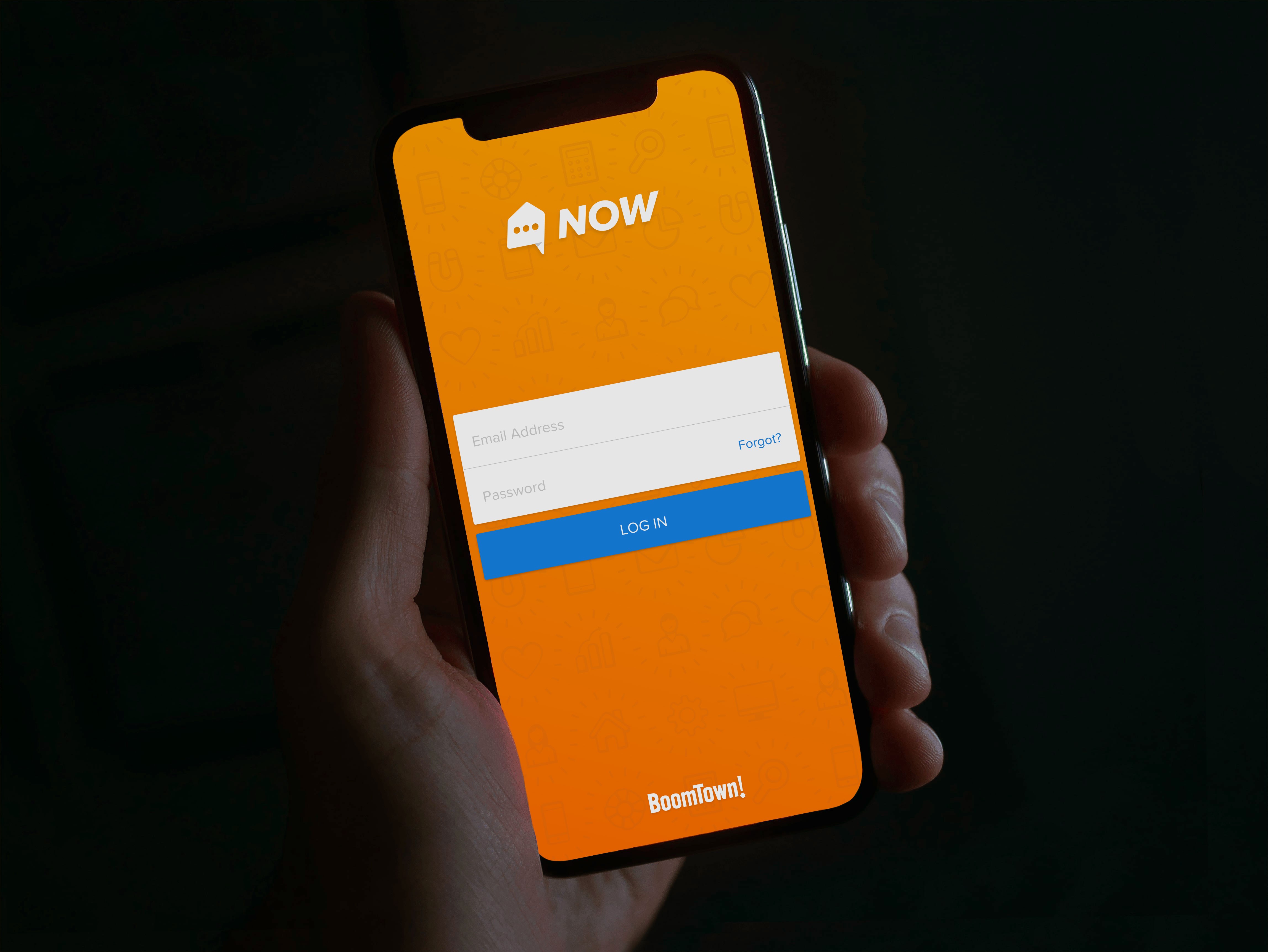
Context
BoomTown’s platform generated leads for real estate agents and gave them a CRM to work them. The data told an uncomfortable story: a majority of agents were dropping the ball. Leads went unanswered, follow-ups slipped, and our platform was letting it happen. Not because agents didn’t care, but because their days were noise. Without a concise answer to “what should I do right now,” they scattered.
Agents don’t live at desks. The desktop CRM could hold every feature we’d ever built, and it still couldn’t be where the agent was when the lead came in. The question we started with wasn’t “should we build an app.” It was can we enable every agent to work the way the best ones already do?
The problem under the problem
Two things stood between us and a mobile product, and only one of them was visible. The visible one: we’d never shipped an app. Internal proofs of concept existed, but none had survived contact with general availability. The structural one cut deeper. We had no API. Every piece of CRM data an app would need was locked inside the platform with no public way to reach it, so the honest scope of “build a mobile app” was actually “build the company’s data access layer, and then build a mobile app on top of it.”
The bet
We ran both tracks at once. Foundation teams built the API while the mobile team designed and built the app, neither waiting on the other. In a perfect world the API comes first; in our world, sequencing them would have doubled the timeline. The tradeoff was real and we knew it: the API came out tailored to the app rather than general-purpose. It also came out fast, with a data structure shaped by actual product needs and fewer calls than bolting onto a generic API would have required.
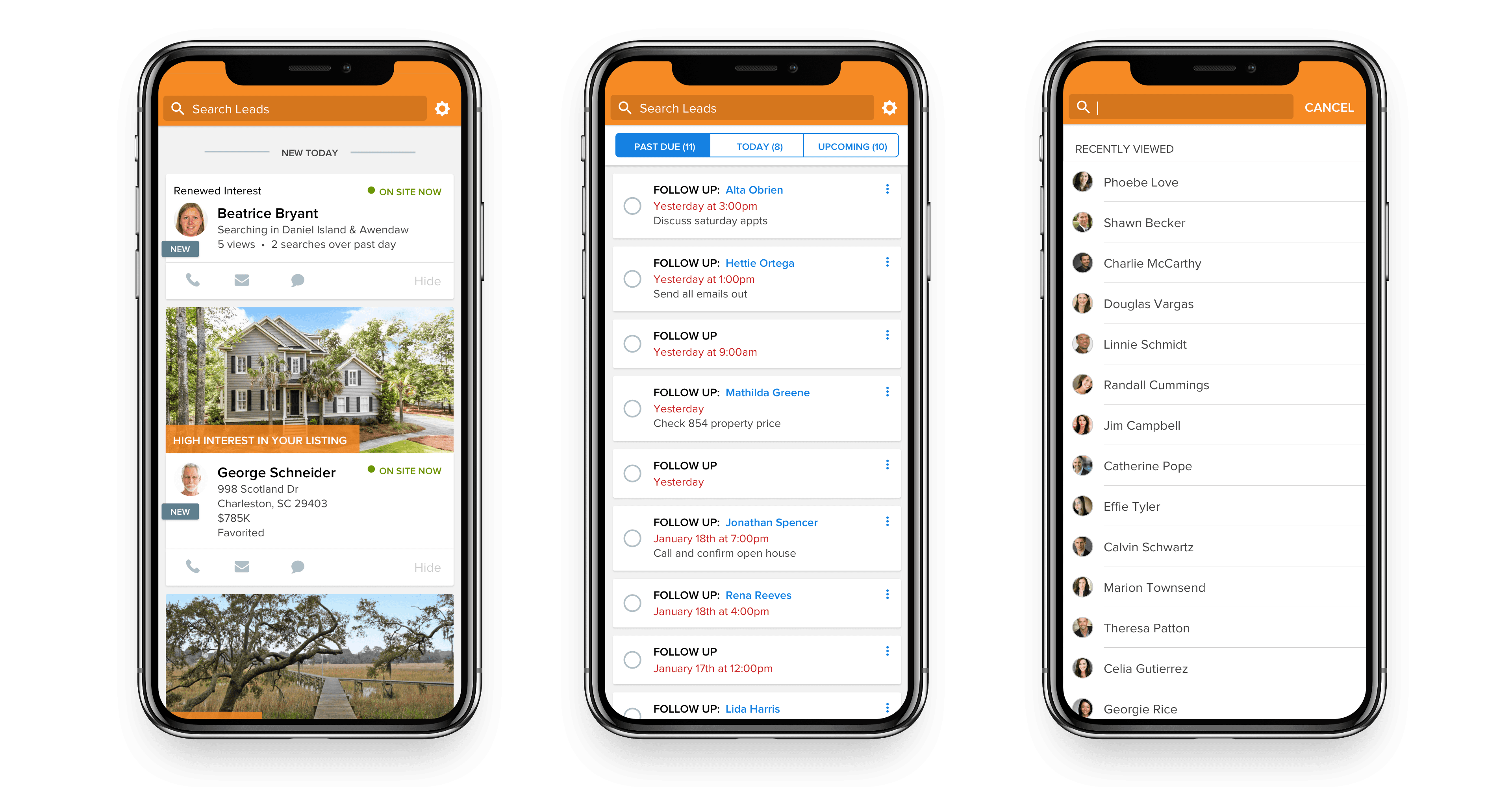
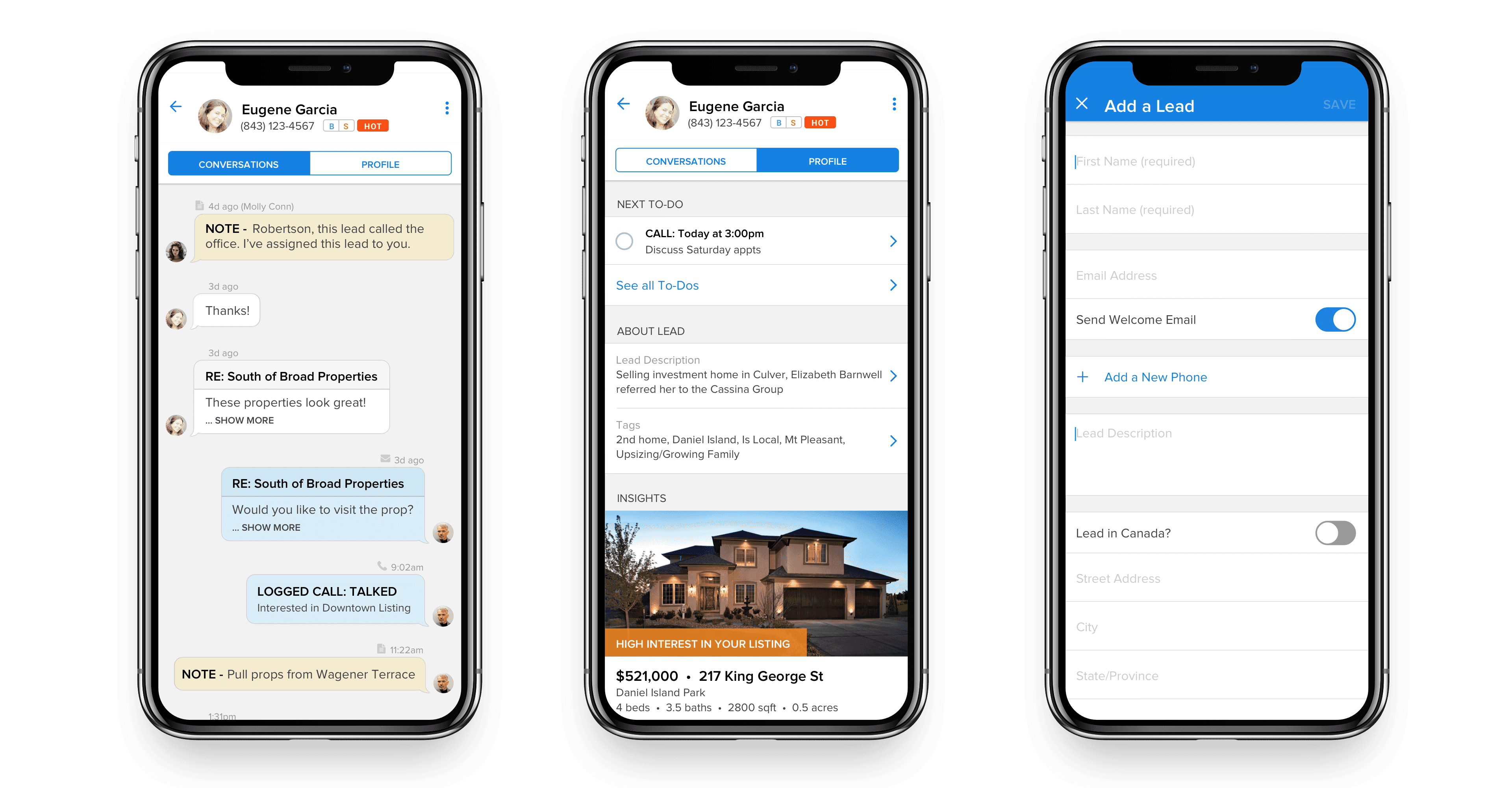
The design bet was about focus. Early on, our cofounder wrote four lines on a whiteboard: have more conversations, respond faster, qualify more leads, set more meetings. Those became the app’s values and our decision filter: every feature debate ended with “does this actually help an agent respond faster?” The app’s entire architecture fell out of that filter, three tabs:
- Waiting on You: every client reaching out by form, email, text, or call, in one list. The app opens on the thing that matters most.
- To-Do’s: the CRM’s action-oriented workflow, carried into the agent’s pocket.
- Insights: opportunity signals worth acting on, like a buyer returning after weeks away, a mortgage calculated, or a profile updated. The right moment to check in, surfaced instead of buried.

What shipped
Parallel development has a known failure mode: both halves look nearly done until you connect them. When the data started flowing, things got real. Race conditions that only existed in production, and a memory issue where long-tenured clients with years of accumulated leads generated more sync data than devices could handle. We rolled out deliberately: iOS first, starting with VIP clients known for sharp feedback, shipping in batches to load-test the API and keep the bug surface manageable, then a month of concentrated feedback and iteration before opening it up.
The design homework paid for itself at rollout: adoption stuck immediately. If we had been fighting for stickiness and debugging a brand-new API at the same time, that combination likely kills the product.
Outcomes
- Average lead response time: ~2 minutes, against over an hour on desktop. The single behavior the app existed to change, moved by an order of magnitude.
- Daily active users surpassed the desktop product (~7,500 DAU, ~18k MAU), and adoption kept growing month over month after launch.
- The most successful product launch in the company’s history to that point. The API built alongside it became infrastructure the rest of the platform could grow on.
The tradeoff I’d revisit
The app-tailored API was the right call for shipping and the wrong shape for the long run. We traded general-purpose design for speed, and that bill comes due as more products want the data. I’d make the same call again, but I’d staff the generalization work immediately after launch instead of letting the tailored version settle in.
And I’d invest earlier in production-parity QA environments. Most of our hardest bugs weren’t logic errors. They were the gap between what QA could simulate and what years of real customer data actually does to a system. That gap is expensive to close and more expensive to ignore.
Team
DJ Fullante and Nate Lacy (Product Design), George Mountis (Product Owner), with the CRM, iOS, Android, and Foundation teams carrying the parallel build. My part was the behavior-change framing, the dual-track call, and keeping the four values on the wall when scope wanted to wander.